Reviews of things I buy for myself

PICkit 4

Illustration

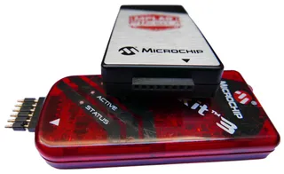
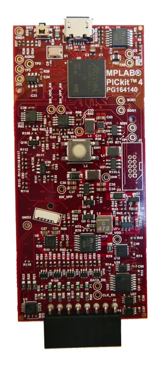
If you are already using PICkit 3, the first thing you’ll notice about PICkit 4 is increase in thickness and width alongside additional 2 pins on it ICSP connector. Finally PICkit can program (and debug) both PIC and Atmel microprocessor family. So let me compare it against it’s predecessor…

As far as I can deduce, there are two reasons for increase in thickness. First one is button/LED mechanism that actually takes quite a lot of space in front of the board. Old system of having button just stick through the plastic allowed shell to get closer to PCB while LED pipe and internal button simply need more space. That said, although I was skeptical about the button and accidental presses, it seems to work fine for now - whether it’ll age well remains to be seen.

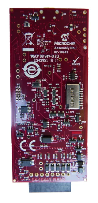
The other reason for the thickness is addition of the SD card slot intended for use with programmer-on-the-go functionality. I say “intended” as functionality is still not available, continuing Microchip’s tradition of removing functionality with the new PICkit only to return it slightly worsened later. As an optimist I will assume this will allow for storing of multiple firmware images (for both PICkit and device). User interface will be hell with only a single button and RGB LED but it would make some sense.

Illustration

However, assuming functionality ends up working as on PICkit 3 with the only one firmware image, I’ll consider it to be over-engineered nonsense. A few hundred kilobytes required for a single firmware image could have been stored on internal memory chip probably even cheaper than what SD card slot costs.

Looking inside, I was surprised to see Atmel ATSAME70Q21 as the main chip (PICkit 3 was using PIC24FJ256). I find the change neither good or bad on it’s own but such completely different platform might justify abandoning updates to PICkit 3 sooner than expected.

Illustration

Despite the wider ICSP connector, I saw no obvious reason for device to get wider either. PCB is not really densely populated and I could bet engineers could have fit all in PICkit 3 case with a bit of effort. That said, I must admit that I like the look of new PICkit better. And yes, new shape is a bit less comfortable on hand, but I could live with it. New looks with the old case size, now that would be something. :)

The first 6 pins of the new connector are fully compatible with the old PIC ICSP and that means you can still directly connect it to any of your old board (assuming PICkit can still fit). If you are using pogo pins you can opt to get a wider (8-pin) pogo connector or just continue using the existing 6-pin one if you don’t need Atmel.

Microchip opted to use micro-B USB connector and I hate them for it. While I would understand PICkit 3 coming with the same, in 2018 Microchip should have used USB type C. It’s about the same size as micro-B but it allows for orientation agnostic plugins. With PICkit 3 it was less of a trouble as mini-B is bit and visible connector but with the new PICkit there is always a need for the three-way handshake.

Illustration

I love the reset button next to USB connector but not for it’s reset functionality. Who’s gonna search for a paperclip to reset the device when unplugging/plugging into USB will do the same? I love it because you can see the main LED through its hole. If you are programming board with your PICkit in vertical position, you will get used to looking at LED from above instead of craning your neck on the side. This is probably the best addition there is.

Experience from MPLAB is pretty much the same as it ever was. You still need to download image into programmer for every damn PIC you use. When you switch between projects there is always a wait and need for Internet connection as it was with PICkit 3. Programming experience itself is similar to PICkit 3 and slightly faster.

All in all, if PICkit 4 was a straight upgrade from PICkit 3, I would hate its bulkiness much more as it does feel more unwieldy than PICkit 3. However, considering PICkit 4 is a single programmer allowing for both Atmel and PIC microcontrollers to be programmed I do think of it as a step forward.

Garmin Vivoactive

Illustration

I am a fan of my Pebble Steel. However, in between Pebble not existing as a company anymore and my own Pebble dying I had to make a decision. Do I get last of the Pebble as replacement or I try something new?

My two requirements were to have long battery life (five days is bare minimum) and reasonable cost (less than $200). Here Pebble shined and Garmin VivoActive fits reasonably well. It has seven days battery life (assuming you avoid GPS) and, if you are willing to wait, you can find it on discount for $150 (I got mine at B&H).

Let me start by saying that Garmin is a sport watch. One that includes GPS and heart strap. I tried activity tracking for a few of my walks and it is interesting to say the least. I never tried heart strap though. All that said, I didn’t buy this sport watch for its sport functionality. I bought it because of its smartwatch functionality. So my review (spoilers!) might seem a bit harsh but note I am not reviewing the whole watch but just a certain aspect of its usage.

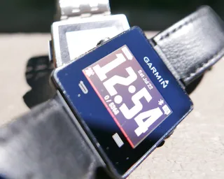
Lets start with the physical shape. Garmin is a tiny bit bigger than Pebble Steel but also much thinner. Both did fit equally well on my wrist but Pebble did look bigger and more intimidating with its steel construction than “plasticky” Garmin. Bezel scuffs are more visible on Garmin and you can see irregularities on black surface much more readily than on steel.

In regards to screen area, they are pretty much the same with Pebble having a vertical display while Garmin opted for horizontal mounting. Garmin does have color screen but I wouldn’t count it as a positive thing as Pebble’s black&white display offers better readability. Unfortunately Pebble also moved to color screen with later models so this excellent screen is exception and not a rule.

Pebble has all its keys on side while Garmin opted to have two side buttons, two on screen, and a touch sensitive screen. While touch sensitive screen is not necessarily a bad thing, Garmin’s execution where support for certain gestures is highly dependent on application and quite inconsistent over platform leaves a lot to be desired.

Charging is done on side pins for Pebble while Garmin has USB connection on bottom. Garmin’s charger is much nicer but you do need to take your watch off to use it. As an interesting tidbit, it is magnetic so you can have it stuck to any metallic surface. This might be side-effect of using magnet to hold the watch and it doesn’t really interfere with anything. I would dare to say some people might even find it useful to keep charger from moving. You can comfortable charge Pebble Steel without taking watch of your wrist but this is the last model allowing for that. All newer Pebbles have chargers at bottom making charging while on wrist uncomfortable at best.

Pebble is quite annoying with its bluetooth-loading application system. If your phone dies you are stuck to a single application that was last running and that’s it. If you need other application - e.g. compass - tough luck. Garmin works similar how Pebble used to. It has certain amount of memory on watch for applications (unlike Pebble’s fixed slots) and you fill it to your liking. As I need only a few things on my watch, I didn’t have problem with that system - I actually prefer it. However, poor selection of half-baked applications in Store is disappointment. Heck, even finding a nice, visible, uncomplicated watchface is daunting task between all “Hello World” apps. It sorta reminds me of Windows Store. Utter lack of applications and even those available are subpar.

Mail functionality is baked-in and it will show you notifications if all goes right. It will only show a few lines by default with option to see more. On Pebble you just push up/down buttons and your done. On Garmin you need to do ancient incantations while stroking screen in hope it will show you more. If you succeed, you will also see just a line or two because some idiot decided to include big X icon beneath it despite having a back button literally 2 millimeters further. It is a total disregard for the limited screen real estate.

But that is not the biggest worry with Garmin as for no apparent reason you might stop receiving e-mails. And it is not necessarily that something is wrong with your bluetooth as you can have Twitter notifications appearing during the same time. And that is the best case scenario as bluetooth will stop and start working depending on Jupiter’s tidal cycle. It makes having smartwatch pointless for me as I have to check my phone regardless. I never had these problems with Pebble.

And let’s not forget Garmin can remind you to move every hour or so if you are inactive. I wanted to like this feature. I really did. But two things are wrong with it. First of all, it doesn’t properly detect when I am sitting vs laying down. So I would get warnings to move my butt even as I was just about to fall asleep. And warning is the same vibration as for message. So you can never be sure if it is message or movement command. And then you walk a bit and you reach your daily goal. This uses the long vibration. Just enough that you think you are getting the phone call. Why so annoying?

Also, despite having the hardware to do so, Garmin also opted not to turn on light when you flick your wrist. That means, if you are in low lightning or god-forbid bed, there is no other way to see screen than to get your other hand to backlight button. Why? It is just a minor simple feature that is actually supported on Garmin’s higher-end watches. They just chose not to implement it here.

Speaking of not implementing stuff, forget any GPS navigation functionality. And I am not talking about mapping - it is obvious that there is not enough memory for that. A simple application allowing to save a few points of interest would go a long way. Or just using damn GPS to sync time. Not at all times as battery is limited resource but when asked to. It is kinda ironic that watch capable of receiving GPS signal fully depends on damn mobile phone for its accuracy.

For my non-sport use case, Garmin’s Vivoactive is a failure. After using it for four months, I simply switched to a normal wrist watch and I’m happier for it. And that is the highest insult you can give to any smartwatch.

The Grand Tour

Illustration

It took them a while.

Yes, finally the Top Gear Grand Tour guys are back and those fortunate enough to either have Amazon prime or torrent can watch the first episode of the brand new show.

Is it same as Top Gear? It is precisely far enough to be legally safe. There is no Stig - instead of him there is a Nascar driver that wouldn’t shut up. There is no lap board - although there is an LCD screen with times on it.

However, based on the intro and the first episode, interesting parts are still in. There are still (super)car-based competitions with fun scoring systems, crazy challenges, testing track located in England, a lot of bantering, and an overall interesting show.

Captain slow, Hamster, and the old Ape are back.

Kindle Oasis

Illustration

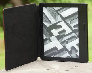
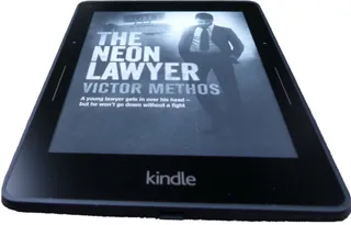
First thing you will notice as you open Kindle Oasis is how small it looks. On a first glance one would tell it has smaller screen than previous Kindles. However, it is all an illusion as screen is well known and lowed 6" diagonal.

I find screen as good as one on Kindle Voyage and, although Amazon claims Oasis’ is better, I cannot say anything bad about the either. My eyes see no significant difference between them. Curiously Oasis abandoned ambient-controlled backlight present on Voyage and I can only say good riddance.

After a long time we finally have physical buttons back. I don’t find them as enjoyable as ones on grandpa Kindle 2 but they are better than press-buttons on Kindle Voyage. Unfortunately there is no way to turn off swipe gestures on the touch screen so accidental page turns are still possible.

It took a while but we finally have a Kindle suitable for lefties among us. As device is mostly symmetric, simple rotation will make it fit in your left hand as comfortable as it was in the right. Even better, it will auto-rotate screen as soon as you do it. Only drawback is that suddenly power button is on the bottom and not possible to press using left hand. It is a minor thing and completely ignorable if you keep cover on and rely on auto-wake.

One of the more important things about any Kindle for me is how it fits and here Oasis is perfect. A slight tapering on the back leaves just enough place for the tip of your fingers to grab and rubbery material they are using makes holding it really comfortable. Unfortunately, that all goes away as soon as you put the cover.

With the cover on, Oasis becomes a bit unwieldy for me. I struggle to hold it both securely and comfortable for any longer duration as nice resting place for my fingers is suddenly displaced by a step requiring me to essentially keep my fingers straight. I found myself simply removing cover for any longer reading. Someone with smaller hands might not have these issues.

Cover itself is beautifully looking but thinness of leather doesn’t really instill much faith it will age well. As it is slightly thicker than Oasis itself, it sort-of seems as an afterthought and a way to offset small capacity of the main battery. It does that reasonably well as I can definitely say it outlasts both Voyage and Paperwhite.

All said, I find Oasis a beautiful albeit expensive device. I believe Kindle Paperwhite is a great benchmark for enjoyable reading and I wouldn’t be dreadfully punished if it was only device I could use. Voyage enhances that experience and Oasis brings it near to the perfection. But, as always, the great enjoyment comes at a great cost.

Anytone AT-3318UV-D

Illustration

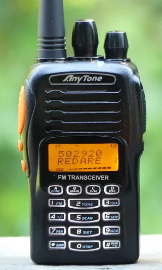
After my Baofeng UV-82HP got banged a bit, I needed a new radio. By pure accident I’ve stumbled upon wouxun.us pages with a wide selection of Anytone radios. Loving airports and all related, I’ve got tickled by built-in AM band immediately. So I decided to go for dual-band Anytone AT-3318UV-D.

First thing I’ve noticed is that radio is much smaller than Baofeng even though it comes in bigger box. Contents are pretty much same: radio, antenna, battery, belt clip, charger, and DC adapter. Anytone additionally has lanyard while Baofeng goes an extra mile and includes a headset.

Anytone looks a bit sturdier than Baofeng, probably due to a smaller build, but I find them comparable as neither is really meant for rough handling. Battery and clip mounting are done much better on Baofeng where I found battery was impossible to remove by accident. Anytone doesn’t instill the same confidence. Further they’ve decided to mount clip on the battery instead of phone body. I find this rather weird and annoying, especially in light of having multiple batteries - each having its own clip ensures you cannot store them easily.

Chargers look equally flimsy and both have possibility to charge battery without the phone. Annoyingly Baofeng uses 10 V as input voltage and thus makes it hard to find a replacement adapter. It did work with 9 V for me but your mileage might vary. Anytone uses pretty much standard 12 V for its chargers and thus earns mega points from me.

Keypad on both uses standard 3x4 numerical layout with additional top row being used for various functions. Main Anytone advantage is having back-lit keys. If you often work in low-light situations this is awesome. On other hand its center number column is wider than ones on side, just showing it is impossible to have a standard keypad without designers screwing around at least a bit.

Baofeng has a dual PTT key, FM radio, and flashlight control on side while Anytone has a single PTT and two programmable buttons with limited function selection. I like having one of them dedicated to momentary squelch off and I prefer leaving the other one unassigned. While I was tempted to assign it as PTT for secondary channel, I rarely used that functionality on Baofeng and what I really missed was a key that does nothing except turning on the display backlight. If you leave it unassigned that is exactly what you get.

Top on Baofeng has power/volume knob and flashlight along with a handy lights showing which channel you are receiving signal from. Anytone has the same power/volume know and additionally brings another knob for rotary channel selection - that works beautifully. It is a bit strange decision to have only single receive LED (in two colors) when you can really simultaneously receive signal from two bands but I so rarely use this (or even see it in daylight) that I don’t really care. Although flashlight wasn’t really strong with Baofeng it did come in handy couple of times. No such thing on Anytone.

Specification-wise, advantage in power should go to Baofeng as it has stronger 8 W radio. However, Anytone pretty much held its own on both receive and transmit side. All repetitors I’ve used with one I could listen to with other and I had similar experience on transmit side. As my Baofeng was already damaged at the time, I cannot draw any finite conclusions but difference in performance is small if there is any.

Both support dual-band operation (136-174 MHz, 400-520 MHz) with Anytone having dual-transceiver instead of the more common dual-watch. Regardless, most of the time both worked equally good for me but for the Anytone allowing scanning and holding a conversation at the same time. It definitely offers a greater flexibility especially combined with MUCH faster scanning Anytone offers. Cherry on the top is possibility to scan CTCSS/DCS tones too - a function I haven’t noticed present on Baofeng. Although with Baofeng’s complicated menu system one can never know where everything is.

Speaking of the menu system, Anytone is a first Chinese radio I’ve used that actually has interface meant for humans. Options reachable directly from keypad are reasonably well selected and menu is good enough that you probably won’t need instructions even if you try to program all channels by hand. Setting up channel purely from handset is something that is impossible to do on Baofeng. Yes, option is technically there but it is really painful to use. Only Baofeng advantage here is allowing for seven characters in channel name instead of Anyone’s six.

Saving grace for Baofeng is Chirp. It is an open-source solution allowing for reasonably comfortable memory programming of multiple devices, including pretty much all Baofeng models. Anytone has its own solution that works badly to say the least. Yes, technically all settings are there but it is hard to say anything good about the interface not allowing for Copy/Paste. Anytone needs Chirp support and it needs it soon.

Both Anytone and Baofeng support FM broadcast band (65-108 MHz) but Anytone actually comes on top courtesy of allowing you to save channels in memory. How this is not supported on Baofeng is beyond me. Anytone additionally offers receive on AM aircraft band (118-136 MHz) strangely hidden behind the FM key. If you are next to a big airport, this one is a gem. Yes, I know you can listen to tower control online, but it is not the same.

Anytone goes even further with support for both shortwave (2.3-30 MHz) and longwave (520-1710 kHz) AM band. This is of limited use as not only antenna it comes with is completely unsuitable but these bands rarely have anything of interest. Yes, one might argue that Anytone’s definition of longwave actually also contains frequencies most commonly known as mediumwave where commercial AM stations live, but it will be a sad day when you actually go hunting for those.

This comparison might not be completely fair as Baofeng UV-82HP is only $60 while Anytone is about three time as much so I struggle to unconditionally recommend it. I find Anytone is the better radio by far but Baofeng will bring you 90% of the way. Best example is Anytone supporting proper narrow band FM. Yes, if other side is transmitting such signal you can often hear the difference as compared to Baofeng. But, guess what, most of the time everybody just uses 25 kHz FM anyhow.

On the other hand, Anytone is much more enjoyable to use as compared to Baofeng. I find it infinitely better when I am away from computer and I cannot get frequencies of repeaters in the area in advance. Not only you can quickly scan around to see which frequencies are in use but you can scan for CTCSS code they use and join the chat. And let’s not forget backlit keys and the awesome aircraft AM band.

PS: Do notice that author of this article is beginner ham at best. I find both devices are appropriate for such - these are not fancy radios nor you should expect wonders for this price.

I've Got a Pebble in My Shoe

A month or so ago a new Pebble Time firmware came to the legacy Pebble devices - in my case the Pebble Steel. For something that is such a big change, installation process went better then expected. Only slightly annoying thing was installing new application on my phone but everything was smooth sailing from there. Until I started using it.

First, the good stuff. Application/watchface selection interface changed a bit to reflect possibility of having an infinite number of applications running. Yes, unlike the old firmware, the new one allows for dynamic swaps.

The new timeline interface was a pretty big change for me as I extensively used watchface swapping and now the same buttons brought different behavior. While I cannot say I am a big fan of the new interface, speaking with other people I will chalk this change to the improvement category. For myself, I still might not be using it much but at least I don’t actively hate it.

The bad stuff is that now you cannot use any application without your mobile phone. Before you had 8 applications but they were all available to you even if phone was dead. Yes, some of those applications might have had issues but standalone stuff worked (e.g. Authenticator). With the new firmware application is loaded only once you access it. If phone is dead, so are your applications. Yes, you might get some use of last running application but that is simply not enough. And lets me not get started about the time needed to enter the applications - it got much longer.

While slowness of the application access I can grudgingly understand, I cannot understand the freaking animation that take ages. And these animations are used liberally within the new timeline interface. Yes, at some places they might be needed to cover for bluetooth latency, but that just means application design is close to wrong if you need to chit-chat between phone and watch that much.

And forget about having multiple watchfaces if your mobile phone is dead. You will stay with whatever was last loaded. While I don’t change my watchface often under normal circumstances, I do so while traveling. As my travels are usually cross-atlantic, this also means I keep my phone turned off most of the time. Not being able to select between my standard watchface and one set at the destination’s timezone is annoying. More so because that used to work just fine with old firmware.

And don’t tell me this has to be like that due to the new interface. Even the first Pebble allowed for 8 applications in its memory. With Pebble Steel memory got doubled (while number of application slots remained the same). Even if we assume doubling of needs, we still could have at least 4 static application slots for the most important stuff (configurable).

And yes, even changing the menu order requires mobile phone as the new firmware removed on-watch menu editing too. Frankly, outside of slow and over-animated timeline interface, I cannot really think of the single thing new firmware actually improved. They just slashed mini features left and right.

I view this new firmware as a step backward whenever you need to use your Pebble as an independent device. Pebble used to shine when paired with mobile phone but it worked nicely even without it. New firmware ensures you need to have your phone turned on and next to you at all times. And even under the best of circumstances, the animations are going to seep the life out of you.

It might seem this text is harsh but I don’t think so. When compared to the other smart watches, Pebble excelled at being a comfortable thing you could use for prolonged amount of time (5 day battery) and not being dependent on a phone to work. With the new update only the long battery life remained. Yes, I am still fond of my Steel and I will keep it for a while longer. However, if it was to die today, I don’t think my next watch would be a Pebble.

Unsung Hero

Illustration

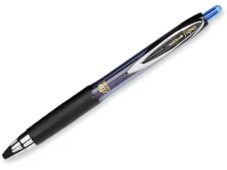
I often write and speak about gadgets I get for myself and how I use them. However, there is one gadget I never wrote about and I use it pretty much every day ever since I got my first one in the late 1997. Those knowing me personally are aware how rare I remember year when something happened so this is something special to me. It is my pen.

There are many like it, but this one is mine. :)

As with many drugs, the first one I received as a gift. It was an Uni-ball Signo DX with a 0.38 tip. Compared to roller pens I used before this one was just sliding without any conscious effort and lines were as thin as a spider web. I watched with dread ink level getting lower and lower. Fortunately I was able to secure the new source before it came to worst. And, in times before Internet, this was a feat.

Then miracle happened and store in my town got quite respectable assortment of Mitsubishi pens. Over the years I tried many of them finally settling on Signo 207 RT (0.5 mm tip) a few years ago. It is quite a similar pen to DX with an advantage of being retractable so I couldn’t lose cap anymore. And switch to a slightly larger tip brought another level of sliding bliss.

I am sure there are pens other find better and have I tried many of them. However, this one works for me and that is all that matters.

Maybe I am an old-fashioned guy but writing and sketching really helps me to think and solve problems. Having a comfortable pen in hand makes a ton of difference.

PS: Those interested in Uni-ball pens can check their godawful web pages. I only wish their pages would be as good as their pens.

IPhone in the Hands of Android Guy

During latest round of company phone upgrades I received an iPhone 5S. As long time android guy (since original HTC Desire) I never actually tried any of iPhone devices more than a few minutes here or there. Now, after using it for a few months, I can share my thoughts.

First impression is great - iPhone 5S is built like a brick. With aluminium on back and glass top it is hard to find it a fault. Buttons are nice and firm, audio connector is best I’ve ever seen, and data connector seems like it could handle a lot. Until USB type C becomes the norm, it is probably the most comfortable power/data connector out there. I am generally not a fan of phone cases so my bias might be kicking in, but it is a sin to put such a phone in a case. And phone can handle occasional fall with grace - at least it did for me.

Turning the phone on was a bit of challenge at first since I haven’t had phone with power button on top for a while. But this was reasonably easy to get used to. What I still cannot get used to is lack of a back button. I find it extremely annoying that, once you have gone deep enough through screens, there is often no way to get back except killing application and starting from start. Yes, some of blame lies with application developers, but at least virtual back button would be nice.

Reality is that sometime you will need to reboot your phone. On Android I got half of my grays waiting for phone to shut down and then boot up. And idiotic decision to remove restart menu option in Lollipop didn’t help. I cannot even count the times I would start shutdown and forget about turning the phone back on. While iPhone doesn’t have restart either, procedure is so fast that it is refreshing.

Where I found iPhone infinitely better than any of my previous phones is e-mail. Due to nature of my work, I have multiple company mail accounts. On Android some of them required me to use special applications (e.g. Touchdown), some of them required special access to device (and probably my firstborn too), or they simply would not work at all. On iPhone they all nicely fall in line and allow usage of default Mail application. Yes, there is no technical reason why Android wouldn’t get the same treatment. However, Android allows more and IT departments jump on it. With iPhone there is only one way how things are done and they learned to accommodate.

Not all is great mind you. Keyboard application that comes by default is simply awful if you need to enter any amount of passwords. I find myself regularly switching through multiple keyboard screens in order to enter anything. Yes, fingerprint sensor can alleviate some of that pain but keyboard is definitely worst one I’ve seen in years. And yes, you can get other keyboards in Apple store and it is frightening how you can actually pay for keyboards with even worse layout.

And Store itself contains bunch of half-baked applications that cost actual money. Yes, there are many half-baked applications in Android store, heck, I even built some myself. But they are free. It doesn’t matter how crappy application is, there’s a cost associated to it in Apple’s store. And yes, there are good free applications but they are mostly coming from big companies. Small utility apps come at a cost.

And application management is crazy. Yes, there are multiple screens but you cannot put your applications there just willy-nilly. Every screen is a list and you will not put application to bottom-right before you fill every other spot. Folders are equally dumb with only nine applications allowed before you get into multi-screen folder. Design so awful that I cannot fully describe its horrors in words.

Preloaded applications are of reasonable quality but nobody will use all of them. And there is no way to remove them from screen. Don’t have Apple Watch or you don’t care for Safari? Tough luck, there is simply no way to remove them. Yes, you can put them in folder but that is as elegant as me telling my socks are suddenly clean if I turn them inside out.

And I finally understood all the jokes about Apple Maps. I tried it a couple of times and it didn’t bring me to my desired destination a single time. Best it could do was to bring me on an opposite side of a building block. With it every day is April 1st. And Siri only knows how to start that abomination - you cannot configure it to start any proper mapping application. So Apple screwed the single thing I used voice recognition for. And I don’t even want to start about Siri.

To access any content on your iPhone you will need iTunes application. That piece of software is greatest sin against humanity since WW2 ended and you need it for even the most simple operations. Wanna ringtone? Stop bitching and use iTunes. And don’t have ringtone longer than 40 seconds. And no, you cannot use MP3 files for it. After being beaten into submission by iTunes, I was really thankful to see that at least my images are accessible as a (read-only!) drive.

Would I buy iPhone for my own private use? Not a chance. Its price is simply not justifiable to me regardless of its good looks and excellent (hardware) design.

However, phone absolutely shines for business use. Ease of setting multiple e-mails without all usual IT nonsense is really refreshing and it allows you freedom I’ve never experienced on an Android device. If you ever had to deal with big company’s IT department iPhone is worth every penny.

The Lost Vikings

Illustration

As my kids keep growing (damn food!) I keep introducing them to games I used to play and love. Most of them I find on GoG but I do have my other sources too. :)

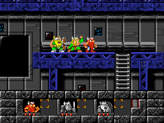
One of those old favorites was definitely Blizzard Vikings. It is a platform game with you in a role of the three vikings taken from their home by evil aliens. Fortunately they got out of jail and through many levels they will try to get home.

To make things interesting, each of them has their special skill. Eric is fast, Baleog has weapons, and Olaf can take care of defense. Only by using each of them you can pass the conundrums in front of them. While first few levels are tutorial and they aren’t hard at all, further you go the more of your gray matter has to be used.

Keyboard controls are probably the worst part of the game. They have to be learned and they are not intuitive at all. Yes, first few levels will teach you everything you need but if you leave the game alone for a few days you are back to square one. Cheat sheet is mandatory.

Of course, it is noticeable that this is an old game. Everything is blocky and resolution is as low as it gets. However, puzzles are interesting enough that you don’t care much. My kids (8 and 6 years) spent hours playing this game and not in one moment they mentioned anything was wrong with graphics. Yes, they do notice it is “different” but they didn’t see it as a negative thing.

Best of all, I found Vikings on battle.net as a free download. Thank you Blizzard.

Bon Voyage

Illustration

For almost five years now I had a Kindle 2 as my companion. Other Kindles came and went and I saw no reason to replace something still working. But there was one thing bugging me for a while now - reading by night. I was pretty much looking to upgrade to Paperwhite when Amazon announced Voyage. So I jumped onto that train.

I decided upon Voyage 3G since I still fondly remember my Kindle 2 keeping me in touch with a world in a foreign expensive land before the age of WiFi. First shock happened when I tried to browse. Amazon actually doesn’t allow browsing on 3G anymore. You can visit Amazon, you can visit Wikipedia, but nothing else is reachable without WiFi. Compared to unrestricted Kindle 2 this seemed as a step backward.

I was also stunned by the fact I could not access my own web site. Since I could access it at an alternate address I would tend to blame this on the lack of SSL Server Name Indication support which I find really strange since Kindle advertises it as an WebKit browser. My guess would be that they’re using quite an older version of SSL code when it manages to fail at thing even Internet Explorer 7 supports.

WiFi itself is 2.4 GHz only which is a bit of disappointment. This is quite literally the newest device I own and only one that has no 5 GHz radio. Yes, 2.4 GHz is more common choice for consumers also but I find 5 GHz a blessing in a crowded environment (e.g., in cities).

Build quality is quite good with a glass front and a magnesium back with a soft finish plastic over it. Only disappointment was a slight misalignment of plastic hiding the antennas with the rest of the body. Fortunately it is not in place where you can easily touch it and it might be only an issue with my device anyhow.

In order to turn the device on you need to reach button on the back. Without cover this operation is annoying at the best. Fortunately, as soon as you get some cover on, things get easier and comfortable. Also annoying is “Swipe to unlock Kindle” gesture at every damn turn on. It is completely unnecessary and serves absolutely no purpose other than showing off the fact you have a touchscreen. This is also solved by putting a cover on (but only if you have version without special offers). As you might deduce, this Kindle is less than enjoyable without a cover.

Since Voyage is a really young device only original Amazon cover is Origami I personally find annoying at best. I’m hoping that Amazon will start selling just a simple leather cover too as same one is available for their other devices. Of course you can always opt for a third-party cover.

On other hand I just adore PagePress buttons. Lack of physical buttons on Paperwhite was what was keeping me back on Kindle 2. Sadly, due to a touchscreen controls, lefties might not really enjoy buttons as they would otherwise. Bezel is really thin so my page turning finger naturally tends to rest at the edge of the screen. This means that each touch to left PagePress button also probably touches screen where that same gesture is interpreted as going one page back.

In the end my page turn occasionally gets interpreted either as nothing at all or as a turn backward. It doesn’t happen often but it kills my flow immediately. Software solution would be simple - just disable touch screen page turns when PagePress is enabled but I doubt that anything will be done since 90% of right-handed people will be just fine with this.

Speaking of page turns, I find it a slightly unnecessary to have a PagePress back button on both sides. Since going backward is a pretty rare operation, having second back button replaced with Home (again, as on Kindle 2) would make more sense to me.

Missing when compared to the Kindle 2 is also any form of audio. While I used read-aloud functionality rarely enough that I won’t miss it, I do miss capability of getting my audio books on it. I dream of a day when I will be able to switch between listening to unabridged audio book and reading it on screen. A beautiful thing when you prefer reading but occasionally want audio (e.g., when driving a car).

Another surprise came when I tried charging Voyage. It would only pull around 500 mA from wall chargers. Compared to 900 mA Kindle 2 could pull this is a real disappointment. I tried using the original Amazon 5W charger but current usage remained the same. Unless Amazon’s fast charger (9W) does better job, I can only deduce that somebody in engineering did a shoddy job and 500 mA is the maximum.

Regardless of all these annoyances I covered in the last few paragraphs, I really enjoy this Kindle. Screen is gorgeous, backlight really pleasant, and it does feel as an upgrade coming from Kindle 2. Even if you are coming from the latest generation Paperwhite you will find new Kindle enjoyable and a quality device. Biggest issue for it will probably be the price since $200 for the basic model and $270 for the 3G one is quite a premium.

All in all I really love this Kindle. Yes, it is not perfect but it is a great companion.

PS: Due to such a crippled 3G, I returned my original purchase and got myself a WiFi-only Voyage.